South Shore Line
Train Schedule Concept
Description
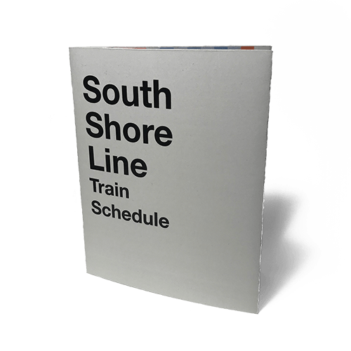
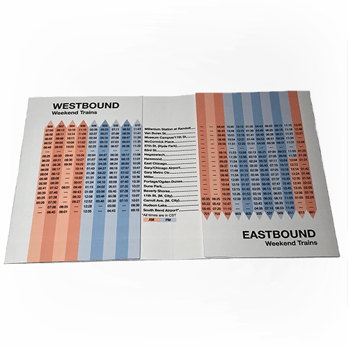
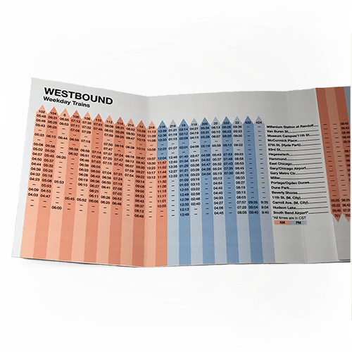
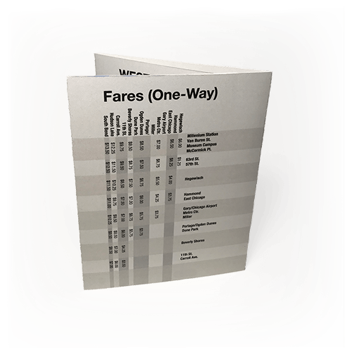
The goal of this project was to organize a large body of information into a compact and easy-to-read format. The content I used for this exercise is the schedule for the South Shore Line, which runs between Chicago and South Bend. My main focuses in creating this project were minimizing the amount of repeated information on the layout and creating a visual system that is intuitive and easy to navigate.
Tools
InDesign, Illustrator


